Just Eat Takeaway (Thuisbezorgd)
Just Eat Takeaway is a leading global platform for on-demand delivery. In this project, I focused on redesigning the app’s visual interface to create a more modern, intuitive, and visually cohesive experience. The goal was to enhance UI consistency, readability, and overall aesthetics while maintaining brand identity. Through refined typography, improved colour schemes, and optimised layout structures, the redesign aims to improve usability, engagement, and user delight.
Project Type
Solo Project
My Role
UI/UX Designer
Timeline
2025 (1 day)

Introduction

BACKGROUND & GOAL
The Orange App
Having lived in the Netherlands for over five years, I’ve witnessed the evolution of Just Eat Takeaway (Thuisbezorgd). In the past, the platform lacked an English language option and had a less intuitive design. As a student, my friends and I struggled to navigate the app and eventually switched to competitor platforms that already offered an English option. Even years later, some people are unaware that the app now supports English, while others still remember it as “the difficult-to-use orange app”—with the name Thuisbezorgd being hard to recall for non-Dutch speakers.
While learning Dutch is important for those living in the Netherlands, many international students & residents do not speak the language at all. Recognising this, major apps like Albert Heijn have introduced English options to expand their reach to a broader international audience. This raises the question:
With the unique strengths Just Eat Takeaway offers, how can it regain the attention of users who have become accustomed to competitor platforms?
How can we make the app more engaging and encourage exploration?
Home
DESIGN ANALYSIS
As soon as the user opens the app, the home screen should be attractive, giving them reasons to scroll and explore more pages. It’s important to grab their attention.
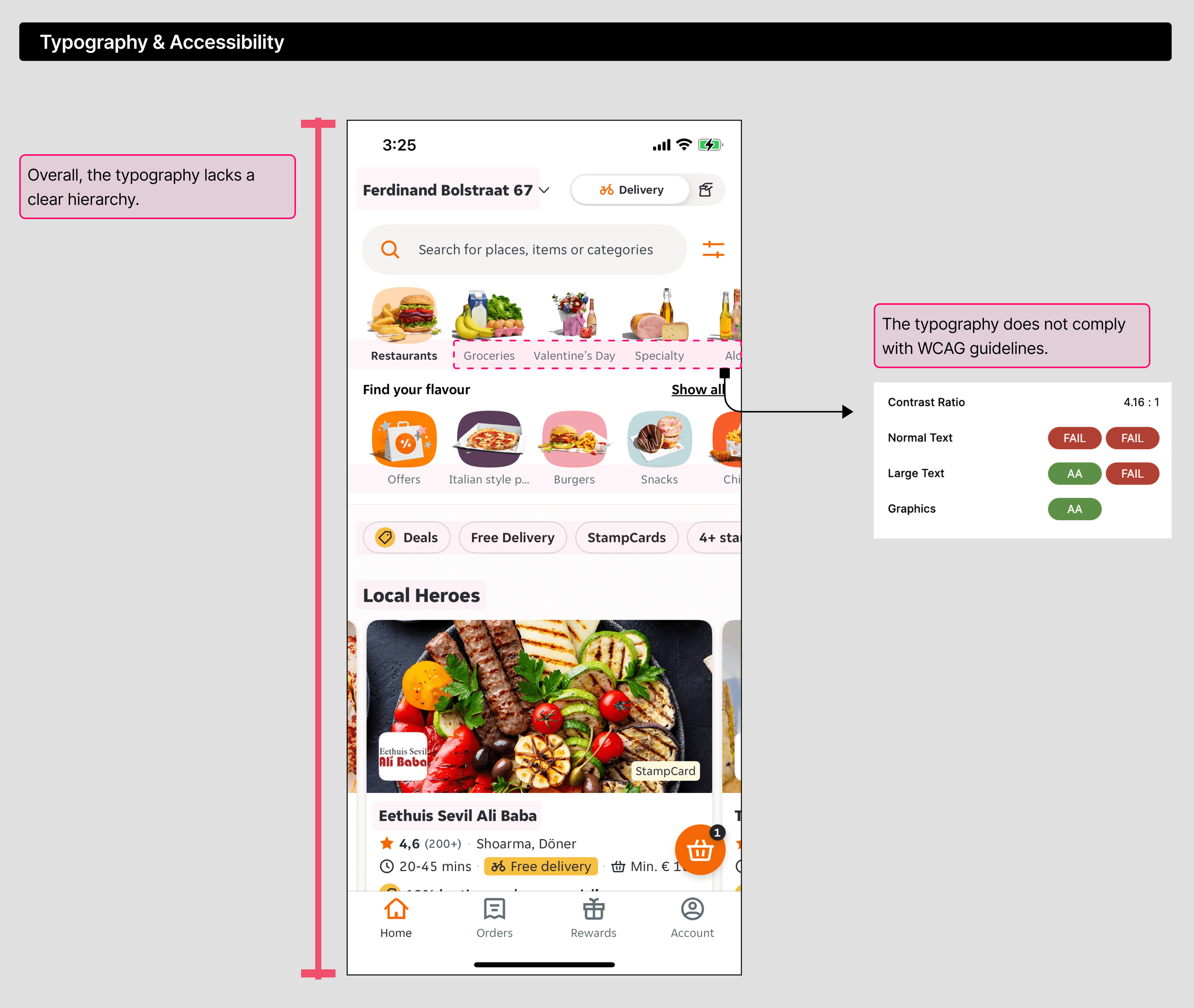
The following is an analysis of the current design aspects that can be improved.
EARLY CONCEPT
There is a lack of clear focal point and visual hierarchy. Since users cannot see any other menu items, if the displayed menu is unappealing, they may lose interest in exploring further.
The redesigned home screen enhances visual hierarchy and showcases more food items, encouraging users to scroll down or swipe.
There were two options for the Home screen: A and B. Since the app serves the same purpose, some common elements make sense. However, the category section resembled Uber Eats, so I wanted to create a design that better fits JET’s identity and applies consistently across other screens. That’s why I chose B as the Home screen.
Chosen Home screen (Option B) ⬇️


